Wednesday, 21 February 2024

Magazines: targeting audiences through demographics & psychographics

Here are my notes from a lesson about how media companies target different audiences. I worked in a group but participated in the discussion

Unfortunately I wasn't able to find a picture of my notes, so I had to re-write them, and I found it not too difficult, since the targeted audience looks slightly obvious


Magazine 1:                                               

Demographic:

Age: 18-35
Gender: Male
Social class: Middle Class - Rich Class
Religion: Not Stated
Race/Ethnicity: Any
Location: America

Psychographic:

Lifestyles: Thrill Seeker
Interests: Riding


Magazine 2:
Demographic:

Age: 40-50
Gender: Female
Social class: Middle Class - Rich Class
Religion: Not Stated
Race/Ethnicity: Caucasian 
Location: Europe

Psychographic:

Lifestyles: Artistic
Interests: Fashion


Magazine Research

 Here is the research for my magazine.

(Reflection is in my answer together with my analysis)


Marketing


Title        : PERAN CTO DALAM MEMBANGUN DIGITAL LEADERSHIP
Publisher: PT INFO CAHAYA HERO

Majalah Marketing is an Indonesian magazine company that publishes information about marketing news and share marketing knowledge. Such as financial services, consumer goods, property & retail, service, advertising, PR, Digital World, SME, Life style, Research, etc.


Media Language:
This issue of the magazine focuses more on the CTO's and how they build their successes through their more digital carriers. This magazine conforms to the convention that most magazines about business or marketing tend to have the big businessman in a very relaxed position for the cover of the magazine. usually either on a chair or couch, or standing up while giving off a smile. The Main cover line is "Inspiring The Leadership" which is a phrase that can hook the attention of people starting a business, or is new marketing, and may feel inclined to buy the magazine to help them in their business career.

Representations:
The men in the magazine are represented positively on the cover, and throughout the magazine and is done so in a simple and easy to understand way. Especially when most of them are wearing nicely fit blazers and formal attire and smiling politely, since more formal attire can indicate that they are well mannered and smart. And typically, successful people tend wear suits or formal clothing when going to off work. By representing these people in that way, the audience who want to start businesses may get more motivated to become a successful businessman and look like anyone present in the magazine.

Audience:
The target audience can be men who want to start a business and are finding the first step that will pave their path forward and shape them to become successful. A form of social relationships rom the uses and gratifications theory could be at play. From how the men are represented, the audience want to be more like them, more successful and well mannered. On top of that, this can be a discussion among other beginner business starters, mentioning how some of them may prove useful and such. Another of Blulmer and Katz Uses and Gratifications theory is used, and that's surveillance. Audiences gather information on business tips and from the magazine and will use them when it's their turn.

Industry: 
The Majalah Mareting publish, mostly everything relating to business, and also has it's own website where it publishes other smaller business related things. This can be more useful since people who want to start a business are typically still young, where younger people are more prone to use internet access. This allows newer audiences to be able to access and find Majalah Marketing's magazines.


Lionmag


Title        : Lionmag
Publisher: Lionmag

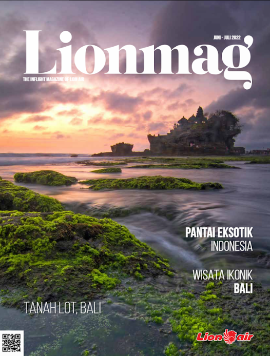
LIONMAG is Lion Air's in-flight magazine. Reviewing tourism and lifestyle, LIONMAG can be read on all Lion Air flight routes in more than 50 cities in Indonesia, including overseas flights such as Jeddah, Malaysia, Singapore and Mecca.


Media Language
The cover of the magazine has a more simplistic feel. The headline "Lionmag" on the magazine cover is written in a huge, bold style, while the subheadings are written in a smaller size. This highlights the main title and establishes a contrast. The stunning beach environment featured on the cover is from Bali, Indonesia. The image, which is vivid and vibrant, displays the green palm trees, the blue water, and the clear sky. In the lower right corner of the image, there is a QR code that urges the reader to scan it for additional information and makes the magazine seem more professional. The color palette of the cover is orange, green, and blue. These colors are associated to warmth, freshness, and the natural world. Additionally, they align with the magazine's subject, which is about lifestyle and travel

Representations
The cover represents the beauty and exoticism of Bali, Indonesia in an incredibly positive manner. It displays an image of one of Tanah Lot Bali, which is one of the more popular spots in Bali that will attract tourists. It also implies that people can take relaxing and restful vacations in Bali. The magazine's cover also serves as an inspiration and informational tool for travelers, with its buzzwords such as, "Tips for Solo Travelers," "How to Travel on a Budget," and "Best Places to Visit in 2023." Additionally, the upper left corner of the magazine features a lion's head emblem, suggesting that it is intended for lions or those who identify as lions.

Audience
The target audience for this magazine is likely travelers or people interested in travel and tourism. They are probably looking for ideas, advice, and stories about different places and cultures. They may also be curious about the lifestyle and experiences of the Bali lifestyle. The target audience may also be people with a more adventurous intent, such as being confident, and sociable. They may enjoy exploring new places, meeting new people, and having fun.

Industry
The magazine is published by Lion Air, which is more popular for it's airline. Since it's an airline, Lion air has a chance to promote their magazines in their flights. This in turn will have a higher chance of reaching the more adventurous audience and for the audience looking for ideas, this magazine would probably be found at stores nearby.


I enjoy how they used nice white space to give a really nice image to text ratio. On the same page it also does a double page spread which to me, makes full use of the white space ratio. They way they compiled multiple images in a very organised manner seems very appealing to me, I think I'll try to implement this into my magazine if I have enough images. I also really like how the front cover seems cluttered but is still navigatable. It does this by having enough colour varation in the texts audiences are able to differentiate sections in the cover.


I really enjoy the cover of the magazine. It really focuses more on the image displayed rather than having spots of text. The text on the cover is only present on the bottom of the cover, which needs a really close look to read, making the most prominent feature of the cover being the main image with only the title present. The usage of whitespace in this magazine looks very average, almost textbook like. Not a big fan of the whitespace in this magazine. I think the only element that I would be using from this magazine is the front cover of mainly being extremely simplistic


The magazine's table of contents looks unique. While it's different, it's still navigatable by making each box a contrasting colour in comparison to the box next to it. The cover again focuses more on the main image, with little or minimal text that are present. It's whitespace I think isn't very good. I think it has too much text and not enough images to make the text to image ratio look more appealing. On the image provided above, only 1 image can be seen while the left page is completely filled with text. Again, I think I'll try to implement how they did the cover of this magazine.

This magazine is clearly leaning towards a more scientific and factual information. Because of this, it's expected that it would have more text than images. The cover still manages to stay eye catching with it's orange and purple colours that form a tube like shape. The double page spread in this magazine to me is very nice, I think that I would implement this in my magazine if it needed more text. Whitespace in this magazine to me is unappealing, but still reasonable since it's expected that there are more text.

Here is a link to my double page spread Research + Development
 https://louis-regentsmedia.blogspot.com/2023/11/double-page-spread.html

Terminology


This is my Terminology for my Component 1

I found some of these key words to be easily memorized since they had correlated meaning, Like main image for example.

MastheadThe name of the magazine, in its typical font, on the cover.
Selling lineThe short description of the ‘identity’ of the magazine under the masthead,
Main imageThe image which fills the cover – a model, celebrity, animal, artefact.
Coverlines‘Teasers’ for the contents of the magazine on the cover.
Typography/fontThe shape, style, size and colour of the letters used.
Drop capThe enlarged initial letter of the first word of an article – an aesthetic feature which is designed to engage the reader.
Pull quotesEnlarged quotes from an article – these may be included in coverlines, but are also used in the body of the article to break up the page and to attract the attention of the reader.
BylineThe name of the writer of the article, usually found at the beginning. Simply, it is the ‘line’ which tells you who the article is by.
Main cover lineThe most important article featured, grabs the audience’s attention (featured article)
Mode of addressThe way the magazine/article addresses the audience. Formal, casual, direct (for images too)
BarcodeUsed for retailers
SkylineA list of keywords featured at the top of the cover
ThirdsThe upper and left third are the most important. why?
PropAn image of an item
Puff / BoxoutA smaller image/text to stand out from the rest of the information (puff=circle. boxout=square)
BuzzwordsExclusive, free, new, special edition
BannerA block of colour with info inside, usually stretches the width of the cover
CaptionInformation about an image.
SpreadPages of a magazine that should be viewed together (usually two)
BorderEmpty space around the edges
White spaceEmpty space in the spread, used to break up the content (negative space)

Component 1 - Brief

 Here is the brief for Component 1 magazine

I think this topic could be slightly interesting for me as I feel excited to create a cover for a magazine

Weekly Progress & Plan

 Here is my weekly progress for the magazine project, and also a rough plan.

My reflection is imputed together with my weekly progress

Week 

Term 2

Week 

Term 3

1

(2 Oct)

Brief, Research

8

( 8 Jan)

Development

2

Research

9

Shoot

3

Research

10

Shoot, Self Reflection

4

Proposal 

11

Post Production

5

Development

12

Post Production

6

Development

13

(12 Feb)

Deadline (Monday 12th February)

7

Development

14


Week 1
- Our teacher showed us the magazine brief. I don't have any violent reactions to the magazine brief, for now I think this may be challenging, but overtime, when I get to learn the terms and techniques.

- Had a game to refresh our memories of the active and passive theories. I found the game to be quite fun even though me and my team lost 

Week 2
- I began on working on the magazine project, finishing the labels, and just started analyzing 1 magazine (my magazine) in big detail. I found it difficult to work on it in school for today because the Internet wasn't performing well for me, so I thin I could definitely have done more.

- I learned about the representation theory, which could prove useful for my magazine project. I still haven't remembered all the representation theories, but I believe i could memorize it easier overtime

Week 3
- Reviewed representation theory
- Did some more work on magazine research
- Did some work on Statement of intent

Problems: Needed more magazines
Solution: Will go out to buy a magazine that will relate to my genre that I've picked
To do: - Pick magazine genre
            - finish statement of intent
            - finish magazine research

Week 4
-Completed statement of intent
- Learned new things about the genre theory and how demographics and psychographics can target          audiences
- Completed magazine research

Problems: unsure if I can get some good images of beaches for my magazine
Solution: ask my parents if we're able to go to some specific beaches, if not I think I might chage my                     magazine genre
To do: - Find some nice beaches
            - Add more names, coverlines and images to my magazine development

Week 5
- I developed on the different theories or key concepts of Media via gallery walk. I found this to be fun because I get to engage and interact more with my classmates
- Researched on Double Page Spread and added it to our research blog post

Problems: I don't have a travel magazine
Solution: Ask my parents on a free day to find and buy a travel magazine
To do: - Add another magazine to my double page spread research

Week 6
- Learned about traditional media and new media
- Practiced on exam styled section A question
- Completed double page spread research and development
- Began writing the article for my magazine

Problems: Magazine isn't related to my chosen magazine to make 
Solution: Buy a travel magazine
To do: - Add another magazine to my double page spread research
            - Find a travel magazine for me

Week 7
- final week of the term
- completed a couple of work that are unfinished

Problems: unsure what else to add for article
Solution: research more about Bali's beaches
To do: - Complete Article
            - Find 3 locations for the semester homework & take 10 photos

Term 3

Week 1
- Learnt about the media industry (Production, Distribution, Exhibition) and discussed
- Discussed about the democratization of mass media, Indigenous media production
Problem: -
Solution: -
To do: -

Week 2
- Learnt media consolidation, where companies merge or get bought by a bigger company or benefits.
- Understood copyright infringement and created a story of our own movie using public domain characters
- Picked out a case study involving horizontal and vertical media, and broke it down and identifying advantages and disadvantages of the companies
Problems: -
Solution: -
To do: -

Week 3
- Learned about news and how they can alter perspectives ia agenda setting
- Learned cross media conversion access content via different platforms ie: books,games,movies,series,animation
- Completed new topics on synergy, and framing
Problems: -
Solution: -
To do: Layout for front cover and front page
Problems

Week 4
- Media Industry Exam Styled quesitons
- Started Critical Self Reflection
Problems: -
Solution: -
To do: Complete Critical Self Reflection

Week 5
- Worked on Front Cover (Mostly done in class only few left to do at home)
- Worked on Contents Page 
- Worked on Double Page Spread

Problem: A significant amount of our time was cut
Solution: Our leftover classwork has become homework
To do: Complete:  -Front Cover
                              - Contents page
                              - Double Page Spread
                              - Location Scouting Table
                              - Critical Self Reflection Presentation
Week 6
- Continued working on Magazine (Front Cover, Contents, Double Page)

Problem: Not enough time to complete in class
Solution: Work on it at home
To do: Complete Magazine, and Critical Self Reflection Presentation

Week 7 (Deadline)

Completed Magazine
- Completed Critical self reflection

Problem: My magazine development is compiled into 1 image
Solution: Explain the steps and my process all in 1 paragraph under the image
To do: -

Week 11
After feedback from my teacher and some of my friends, I've tweaked the design to lean more into their feedback.

Reflection
I didn't pay too much attention to the weekly progress, however it did help keep track of my progress and helped me realize what things that I'm missing or what I had to work on. But most of the times I just remembered them or my friend reminds me of those tasks and assignments, so it didn't help me too much. In the beginning I felt excited to design a magazine since I had some ideas that I wanted to try out. Though, overtime, I began to procrastinate as tasks from other subjects piled on me and I got lazier and had little motivation to complete my magazine. This, lead to assignments being crammed into one week, and I had a hard time. Throughout that week, I asked for suggestions and feedback from some of my friends to help with my magazine project while also giving some of my opinions on their magazines. From this lesson, I learned that time management is valuable. If I wasn't lazy and had better time management, i feel like I would have enough time to go at it at my own pace and discover different techniques used in magazines slowly and wouldn't have anything chasing me

Wednesday, 1 November 2023

Technical Skill (Online)

These are the obstacles that I encountered during creating a new blogpost, this also includes my solution to those problems

 My reflection is imputed together with my findings and solutions

1. I was unable to paste the terminology table into my blogpost


2. As a solution, I pasted the table into a google spreadsheet document and edited it so I was able to paste it into my blogpost


3. I pasted it into my blogpost


3. I had issues in pasting my image into this blogpost


4. I solved this issue, from my friend, in blogger.com I have to manually insert the image using the "insert image" option in the toolbar provided for constructing the blogpost.

5. I successfully insert the chosen images into the blog

Wednesday, 18 October 2023

Stuart hall

2. Short description of Stuart Hall's theory

a. What a representation is
    How a certain group of people are portrayed. The group of people can be Religion, gender, age, race     or ethnicity social class LGBT and disability. 

b. Meaing
    Representation doesn't have a fixed meaning. It gives meaning to events/people/groups/after the            occurrence 

c. What a stereotype is?
    Stereotypes are a representation that is repeated enough in the media.

d. Why are stereotypes used?
    Stereotypes are used in media to give more diversity in the writing room/production. It is also easily     show the audience to interpret the meaning of a specific character quickly

e. What social groups are represented in the media
    - Religion
    - Gender
    - Age
    - Race/Ethnicity
    - Social Class
    - LGBT
    - Disability


3. 

Social group 1

a. Balinese people (culture)
b. They are represented as being interesting and very cultural. The scenes in the video 
c. To attract tourists attention to go to Bali
d. The audience (tourists) receive this message of Bali being a wonderful and interesting group of            people that are still in touch with their cultural beliefs
e. 
https://youtu.be/Wc2Ig7cSzvs