This is my Digipak Research & Development, Most of this was made by me.
In this blogpost, I will show the album covers and digipak backsides that I've looked at as inspiration for my front cover and back cover digipak, as well as my progress in creating the digipak.
Here are some indie album that I've taken a look at for my digipak
These Indie album covers seem to follow a convention of having grainy imagery of an abstract photo that may have meaning behind it, sometimes being poorly lit. Some album covers also feature duo-toned imagery. The typeface used for all of these covers seem to be sans serif typefaces. These are the visuals that I will attempt to replicate in order to conform to Indie album cover conventions.
Instead of putting all the sides of the digipak in one file, I decided that I'll do it in sections, front cover, back cover, spine, etc.
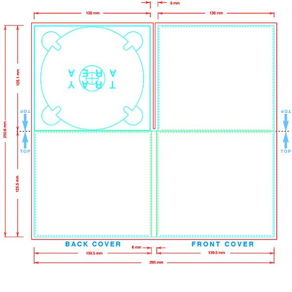
I will be using the template above that I've found from the internet as a sort of reference to measurements that will be needed for my digipak. Once I've completed the different each section.
Here are my first batch of drafts
I used these images as they reflect the sad story covered in the music video. For all of these images, I've followed the abstract hidden meaning convention, where each image has more to it when not taken at face value.
For my 1st draft (top left) I chose the image, as it used an extreme long shot and some neon lights being shown. I've done this to show isolation and loneliness done by the extreme long shot, and a hint of happiness represented by the minimal colorful neon light, to reflect how the music video's story is how the star has become lonely and lost his friends. The hint of happiness is also shown in the music video when the star was reminiscing the fun memories with his friends.
For my 2nd draft (top right) I also chose this image since it shows someone being alone which explicitly tells the viewer themes of isolation. This is done through the long shot showing no-one around the area except for 1 person in the middle of the screen. However, The hint of happiness isn't represented by the neon light but instead with the yellow-orange street lamp since the colour yellow connotes joy and happiness, though, I think that it's a little too prominent to only show a hint of joy.
My 3rd draft (bottom) was chosen since it shows both the extreme long shot for isolation, and the neon light for a little bit of cheerfulness. The most prominent reason for choosing that image was because it had both those technical elements as well as a sign facing away from the camera. I liked this since it connotes that there is hidden meaning that the viewer isn't able to tell right away, but is present in the cover. Though this could also connect to the hidden reason on why the star had lost his friends, since it wasn't explicitly explained in the music video.
I was unhappy with these drafts as to me they weren't appealing enough for a general audience. I also noticed that I failed to follow the convention of sans serif fonts, so I decided to make a few more drafts for the front cover digipak. I also later realised that the measurements were not the same as the reference.
Here are my second batch of drafts
I used these images since the main song of the album and the album name is "TELEPHONES", and these images feature a telephone. I've done this so that the audience can make a quicker connection to the music video so that they wouldn't need to look to hard to look at hidden meaning so that they'll quickly be able to realise and make connections through the branding.
My fourth draft (top left) had the name of the album on a bit of a corner to explicitly make the audience create connections. I've tried to use a yellow tint to represent the happiness this time, however, I think that the yellow was shown too prominently so it was no longer just a hint and is excessive. Later on the typeface to me seemed too aggressive for a much slower paced song, so I decided to lessen the intensity of it in later drafts.
My fifth draft (top left) I realised that I loosely followed the conventions in the first draft, so I continued with the sans serif typeface that indie covers have, however I added a bit of texture to the title so that It would look too boring. I also got rid of the yellow tint since, it was too excessive in the first one, however I did not find a way to show the small bit of happiness in this draft. even though the serif typface was already used to conform to conventions, I've tried to use another cursive typeface for the band name in order to slightly subvert from Indie cover conventions.
For my sixth draft (bottom) I've changed the serif typeface to be a little skinnier and get rid of the texture since it was it looked too distracting and out of place for me, everything else remained the same, however I've added more texture to make the cover seem a lot more messy and noisy to conform to conventions.
These drafts to me still felt too bland, since the image looked like it was barely touched and I failed to conform to the duotone convention. I've also realised that the latest draft looked to messy for my liking and could be changed to make it still look appealing while it not being to noisy.
These are my third batch of drafts
For my third batch, I've used the same image as the last batch, however this time, I've implemented the duotone convention.
for my seventh draft, I haven't implemented the duotone effect, however I tried to change the placements of the title and band name to make it look more appealing for the audience and less boring. The title colour has also been changed so that it uses the colour blue, to show sadness and connect it with the depressing themes of the song and music video. I've also dimmed down the amount of messy white highlights on the cover since it looked to messy in the previous draft. I've also added a bit of noise and grain to conform to the textured grainy look to Indie covers.
For my Eight draft, I've repositioned the texts so that they were in the original spot, however this time I've added the duotone effect, with the two colours being blue & yellow, in order to show both the happy and sad feelings that the music video connotes. The telephone is mostly the yellow part since the happiest moments of the star was when he could call back to memories with his friends.
For my ninth and final draft, the only thing I've changed is the position of the texts, to make it the same as my sevent draft, while having the duotone colours from my eight draft. Everything else is kept the same.
I feel satisfied with with ninth draft and will probably use it as the front cover of my digipak. I'm beginning to see the theme and visual for my digipak, so I will continue to follow the visuals from the front cover and bring it over to the back cover as well.
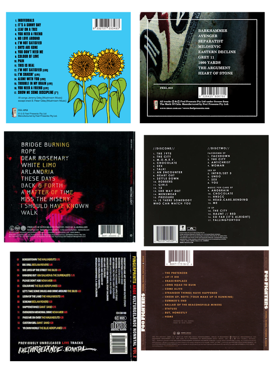
Here are some back covers and spine digipaks that I've taken a look at for my digipak
The back of digipaks often give have a track list on the left hand side of the back cover, featuring the songs that are inside of the disc in the digipak. The back cover also shows a bar code on either corners of the back, as well as some legal infringement commonly done near the bottom of the backside. The spines are also included in some of these, where it features mainly only the artist name as well as the album name.
Here are some of my back cover and spine drafts
Here are the first couple drafts of my backside digipak. Since, I've already have a theme and a visual I can follow, it made it easier for me to create the next sections since I've already have an idea for what I need to follow. For my back cover, I used the main song as the first song on the track list, with the rest being lesser non-important songs. I've followed the duotone and grainy visuals I had with the front cover, and I've also included the band's name on the back of the digipak. I've also put the band's name and album name on the spine of the digipak.. I Since these drafts are very similar with the only difference being the placement of the band name and barcode, I think I'll go with the second draft (left) as the official back cover and my spine draft as the official spine.
Here is an example that I found of the inside of an Indie digipak
The inside of Indie digipaks often show the entire band, meaning all the band members in one frame and shot on the inside of their digipaks. Continuing to follow the conventions of the digipak's cover, duotone, grainy,
etc.

These are my drafts for the inside of the digipak, I think they look alright as they follow the conventions and look good enough for the audience. Since showing the members is part of the conventions, audiences also get to see the band members.
Here is the final Digipak in the form of the reference
I think I'm satisfied with the overall result of the digipak, however I feel like the disc section could be improved more, however I didn't have any images or couldn't come up with any ideas for that section. I found it easier to be worked in sections since I can put it all together in the end and it turned out pretty good. After the last draft of the front cover, I found my footing and knew what to do for the next sections, since I already had a theme set in place after the front cover was done. I like how almost all of the digipak follow a chosen visual.


